I love maps dearly. Give me a map of any kind and I'll be thoroughly entertained. I love looking at the map in the airplane magazine that shows the airline's routes. I love looking at globes. I got a large wall map of the world last year and regularly stand there looking at it. In Kazakhstan I had a nightmare situation in a travel agency and sat there for over three hours waiting for the "lady" to get there who could help me-- it didn't matter, because they had a world map on the wall. And because all the countries' names were written in Russian, I had the Russian alphabet down cold by the time the "lady" arrived. Crazy Kazakhs.
One time back in middle school, the teacher handed everyone a distorted map of the world. It was distorted because the size of all the countries was based on their population rather than their actual size. It was a thrilling moment for me. Since then, I have often thought back to that moment and that map. Where had it gone? What could have been if she and I had stayed together? Could she have been The One?
So the other day I said screw it and went online searching for her. I quickly discovered an entire wealth of these distorted maps, which I learned were called "cartograms."
Cartograms can measure any statistic-- not just population-- simply by distorting countries' sizes to represent their amount of the statistic being measured. Needless to say, this has been an exciting day for me-- and because it's Christmas, I'm going to share my findings with you.
Below are what I have deemed to be the most fascinating cartograms-- the first batch about the American political breakdown, and the rest about the world (to see larger versions of any of the world maps, drag them into an internet browser).
This is a cartogram of the United States. States' sizes on the map represent their populations (Montana and Wyoming are mad small). So now the political breakdown looks more even:
Breaking it down further, this map divides the country into each individual county, and shows how the county voted:
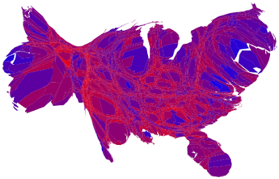
And the county cartogram. Notice how many people there are in LA, the San Francisco Bay area, and New York:
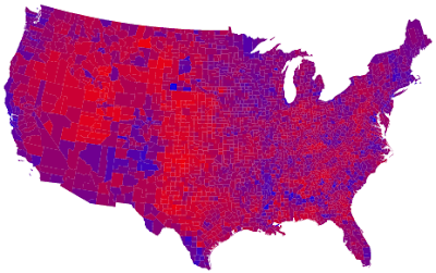
This takes it a step further and colors each county degrees of red and blue based on how strongly they voted in their direction. Ones that are entirely red, for example, voted about 90% for Bush or higher, while the purple ones were more mixed. Notice how Republican Utah is:
And the cartogram:
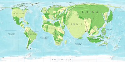
The below map, on the other hand, looks weird because the areas are all entirely accurate. Notice how much smaller Canada, Alaska, Greenland, Europe, and Russia look. And look how huge Africa is. Mad huge, that's how. South America is actually about the same size as North America, but it doesn't usually appear that way:
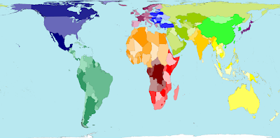
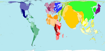
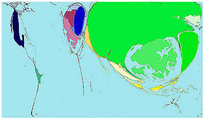
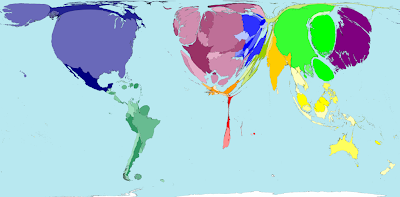
Below is a population cartogram (the original map that got me started on all this). Deliciously interesting. Countries' sizes represent their populations. India and China are ridiculous. And look how tiny Canada, Russia, and Australia are:
Another population cartogram, with countries' names written in (this is a good one to drag into a browser):
Now a bunch of other statistics shown by the cartogram. When you're confused about which countries are which, look back up to the Land Area map for help-- the colors stay consistent (I couldn't be having more fun right now, incidentally. I might as well be on a moonwalk full of slinkies and iPhones).
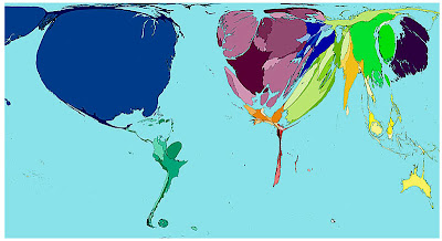
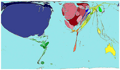
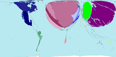
This one shows the prevalence of AIDS. Bad times in Africa:
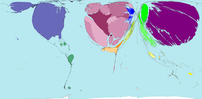
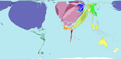
Military spending:
Toy imports. White kids and their effing toys:
Toy exports. Well then. China's the ridiculous one, the large blob to the right of China is Taiwan, the lighter green broken up area is Hong Kong, and the only significant thing in the Western Hemisphere is Mexico:
Fish imports. Japanese people are obsessed with fish:
Internet users in the year 1990. Almost all US, with a bit of Western Europe, Taiwan, South Korea, Japan, and Australia:
Internet users in the year 2002. The rest of the world caught up. Except Africa. Poor Africa. The bulge at the bottom of Africa is South Africa, with all of its European transplants:
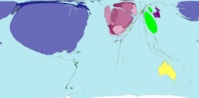
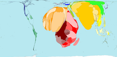
This one's sad-- Child Mortality of children ages 1-4. Notice large Pakistan above India and large Bangladesh in the East part of India.
Car imports:
Car exports. If it appears that the US is prominent, you're incorrect-- that's Canada and Mexico. The US is non-existent. These two cartograms show that NO one drives Fords, Chevys, or Dodges outside the US. Probably a good reason for that. On the other hand, Japan being so tiny in the above map and so large below shows that everyone loves Japanese cars, and that the Japanese don't drive anything else (and hence their non-existent imports). The two other prominent countries are Germany and South Korea. I have a Honda.
Medicine exports. Who knew?
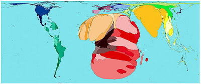
War deaths in the year 2002. Someone really needs to help Africa. The large black country is the Democratic Republic of the Congo (on a completely unrelated note, The Democratic Republic of the Congo was not prominent on the "Tourism" cartogram). The large South American country is Venezuela. Afghanistan and Pakistan are predictably large. Other fun-filled participants include Russia, Burma, Bulgaria, the Philippines, and Indonesia:
This map shows every country in the world with the same area. Completely useless, but kind of cool:
Finally, this is a link to a video/map on the religions of the world. A ridiculously good time.
http://www.mapsofwar.com/ind/history-of-religion.html
And that ends the exhibit. Merry Christmas. Extreme nerds should head to www.worldmapper.org for more.
I'd also like to officially welcome back the old fashion white background (black backgrounds are so 2007).
One time back in middle school, the teacher handed everyone a distorted map of the world. It was distorted because the size of all the countries was based on their population rather than their actual size. It was a thrilling moment for me. Since then, I have often thought back to that moment and that map. Where had it gone? What could have been if she and I had stayed together? Could she have been The One?
So the other day I said screw it and went online searching for her. I quickly discovered an entire wealth of these distorted maps, which I learned were called "cartograms."
Cartograms can measure any statistic-- not just population-- simply by distorting countries' sizes to represent their amount of the statistic being measured. Needless to say, this has been an exciting day for me-- and because it's Christmas, I'm going to share my findings with you.
Below are what I have deemed to be the most fascinating cartograms-- the first batch about the American political breakdown, and the rest about the world (to see larger versions of any of the world maps, drag them into an internet browser).
The American Political Breakdown: 2000 Presidential Election Results
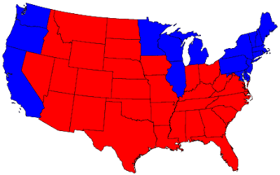
This first map shows which states voted for which candidate in the 2000 Presidential elections. Looking at this, it seems that the country primarily votes Republican:

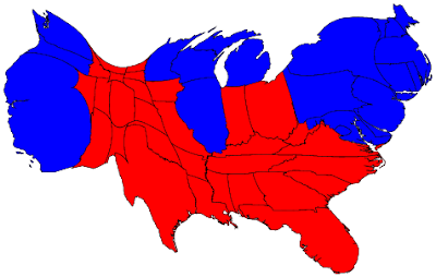
This is a cartogram of the United States. States' sizes on the map represent their populations (Montana and Wyoming are mad small). So now the political breakdown looks more even:

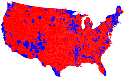
Breaking it down further, this map divides the country into each individual county, and shows how the county voted:

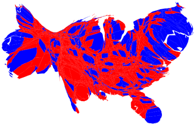
And the county cartogram. Notice how many people there are in LA, the San Francisco Bay area, and New York:

This takes it a step further and colors each county degrees of red and blue based on how strongly they voted in their direction. Ones that are entirely red, for example, voted about 90% for Bush or higher, while the purple ones were more mixed. Notice how Republican Utah is:

And the cartogram:

The World
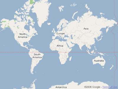
This is a traditional map of the world as we usually see it. In a traditional map, nothing is really accurate at all. The Northern Hemisphere appears much larger than it actually is because the equator is typically placed lower than the middle of the page. And by stretching out the poles so that they're as wide as the equator, Northern countries and Antarctica appear far too large:

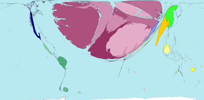
The below map, on the other hand, looks weird because the areas are all entirely accurate. Notice how much smaller Canada, Alaska, Greenland, Europe, and Russia look. And look how huge Africa is. Mad huge, that's how. South America is actually about the same size as North America, but it doesn't usually appear that way:

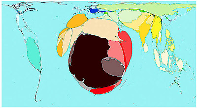
Below is a population cartogram (the original map that got me started on all this). Deliciously interesting. Countries' sizes represent their populations. India and China are ridiculous. And look how tiny Canada, Russia, and Australia are:

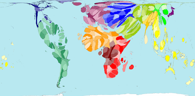
Another population cartogram, with countries' names written in (this is a good one to drag into a browser):

Now a bunch of other statistics shown by the cartogram. When you're confused about which countries are which, look back up to the Land Area map for help-- the colors stay consistent (I couldn't be having more fun right now, incidentally. I might as well be on a moonwalk full of slinkies and iPhones).
This one shows the prevalence of AIDS. Bad times in Africa:

Military spending:

Toy imports. White kids and their effing toys:

Toy exports. Well then. China's the ridiculous one, the large blob to the right of China is Taiwan, the lighter green broken up area is Hong Kong, and the only significant thing in the Western Hemisphere is Mexico:

Fish imports. Japanese people are obsessed with fish:

Internet users in the year 1990. Almost all US, with a bit of Western Europe, Taiwan, South Korea, Japan, and Australia:

Internet users in the year 2002. The rest of the world caught up. Except Africa. Poor Africa. The bulge at the bottom of Africa is South Africa, with all of its European transplants:

This one's sad-- Child Mortality of children ages 1-4. Notice large Pakistan above India and large Bangladesh in the East part of India.

Car imports:

Car exports. If it appears that the US is prominent, you're incorrect-- that's Canada and Mexico. The US is non-existent. These two cartograms show that NO one drives Fords, Chevys, or Dodges outside the US. Probably a good reason for that. On the other hand, Japan being so tiny in the above map and so large below shows that everyone loves Japanese cars, and that the Japanese don't drive anything else (and hence their non-existent imports). The two other prominent countries are Germany and South Korea. I have a Honda.

Medicine exports. Who knew?

War deaths in the year 2002. Someone really needs to help Africa. The large black country is the Democratic Republic of the Congo (on a completely unrelated note, The Democratic Republic of the Congo was not prominent on the "Tourism" cartogram). The large South American country is Venezuela. Afghanistan and Pakistan are predictably large. Other fun-filled participants include Russia, Burma, Bulgaria, the Philippines, and Indonesia:

This map shows every country in the world with the same area. Completely useless, but kind of cool:

Finally, this is a link to a video/map on the religions of the world. A ridiculously good time.
http://www.mapsofwar.com/ind/history-of-religion.html
And that ends the exhibit. Merry Christmas. Extreme nerds should head to www.worldmapper.org for more.
I'd also like to officially welcome back the old fashion white background (black backgrounds are so 2007).
10 comments:
most interesting blog entry ever.
dope stuff. maps are awesome. i think the prez maps are from 2004 though, and not 2002 (mostly because there was no presidential election in 2002).
white background is much appreciated.
oh, and check this for fun:
http://www.travelpod.com/traveler-iq?ac1d=0bb9
holla
so fascinating!
Ha , remember those from when I was
trying to work out how Bush won.
Can't fool me I know where I am , a
lot closer to dangerous sharks and
jellyfish apparently.
With a white background now I don't
think I'm walking into screen doors
frmr jhi ...
ps Any stars call for advice?I hope
not.
Looking for Porn ... got Maps ... sweet.
Upon review the cartogram of votes
on A6 candidates shows my vote for
Tim makes me like a Japanese Chevy
driver , there's just ocean.
frmr jhi ... Merry Xmas anyway.
being a map nerd myself, I thank you so much for such a great blog entry.
My god, you may be nerdier than I am!
:::goes over to bug collection::: It's ok, little buggies!
Make maps, not war...and thanks for the thoroughly entertaining entry.
Thank you, thats very interesting information. I need to share with my friends.
Post a Comment